

No results for ""
Charts
Creating a Chart
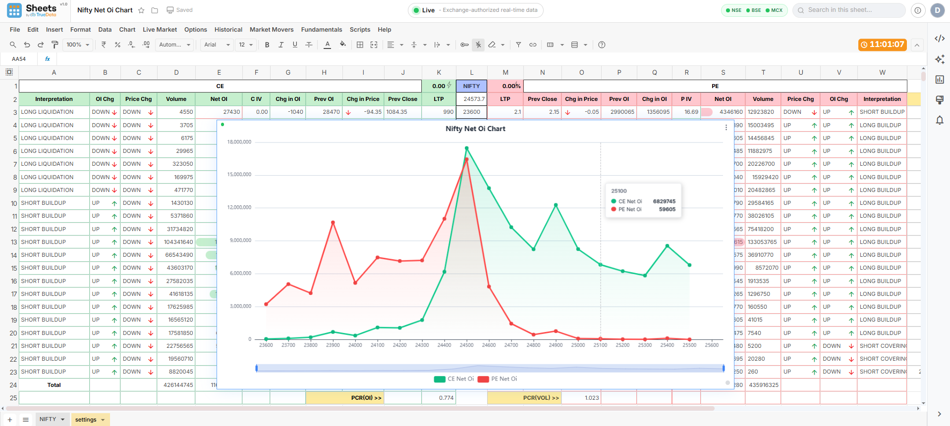
Select any range of cells containing the data you want to plot, then insert a chart directly from your selection. Choose a chart type from the toolbar and the chart is added to the sheet, where it can be moved or resized freely. Charts stay linked to your source data — as live prices, option chain values, or formula results update, the chart updates with them.
Bar Chart
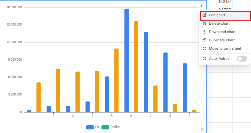
Compare values across categories side by side, e.g. CE Net OI vs PE Net OI per strike.
Line Chart
Track trends and movement over time or across strikes, e.g. LTP or historical closes.
Pie Chart
Show proportion and share of a whole, e.g. Net OI distribution across strikes.
Setup
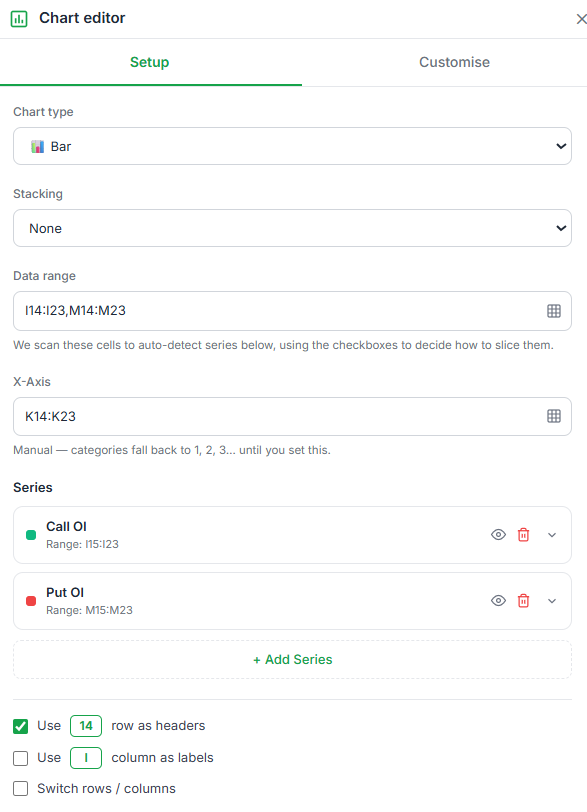
Chart type, stacking, data range, X-axis, series, and header/orientation options.
Customize
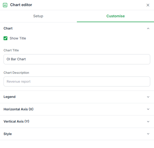
Chart title, legend, axis styling, data labels, zoom bar, and series colors.
Setup Panel
Chart Type
Switch between chart types at any time without losing your data range.
Stacking
Applies to Bar and Line charts with multiple series.
Data Range
Edit or expand the source range without re-creating the chart. Supports multiple non-contiguous ranges, e.g. K2:K23,E2:E23,Q2:Q23.
X-axis
Choose which column or row supplies the category / X-axis values. Auto-filled from the data range while "Use column as labels" is on — edit freely to override.
Series
Each series plots one column/row of values. Use + Add Series to plot additional columns on the same chart. Each series row has an eye icon (show/hide), a delete icon, and an expand arrow for per-series options.
Header & Orientation
Use row as headers, use column as labels, and switch rows/columns toggles.
Available chart types
| Group | Type | Best for |
|---|---|---|
| Basic | Bar | Comparing values across categories/strikes side by side. |
| Basic | Line | Trends over time or across a continuous range (e.g. strike prices). |
| Basic | Pie | Proportion of a single series as a share of the whole. |
| Advanced | Area | Trend plus magnitude — same as Line, with the area beneath filled. |
| Advanced | Scatter | Correlation between two numeric series, plotted as points. |
| Financial | Candlestick | OHLC price action from historical or live bar data. |
Working with Series
| Add Series | Adds another column/row as a new plotted series on the same chart. Each new series can use its own range. |
| Eye icon | Toggles visibility of that series on the chart without deleting it. |
| Delete icon | Removes the series from the chart entirely. |
| Expand arrow | Opens per-series settings such as axis assignment and range editing. |
Customize Panel
The Customize tab has sections that expand and collapse independently, each controlling a distinct part of the chart's appearance.
Chart
Show/hide chart title, plus Title and Description text inputs.
Legend
Show/hide legend, with position control.
Style
Data labels, zoom bar, and per-series color pickers. For Pie/Donut charts: donut toggle, inner radius, label position, and percentage labels.
Horizontal Axis (X)
Show/hide axis, axis title, position, axis line, grid line, ticks, and labels with rotation angle.
Vertical Axis (Y)
Axis title, position, axis line, grid line, ticks, and show/hide labels.
Chart — field reference
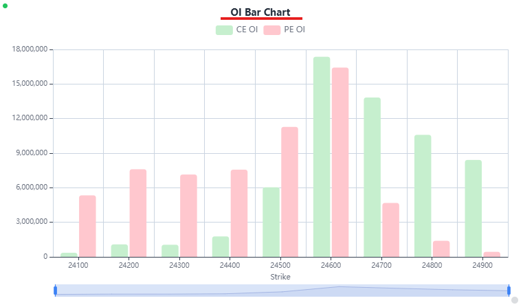
| Show chart title | Toggle the title on or off above the chart. |
| Title | Text input for the main chart heading, e.g. "Nifty Net OI Chart". |
| Description | Optional subtitle text shown beneath the title. |
Legend — field reference
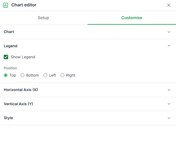
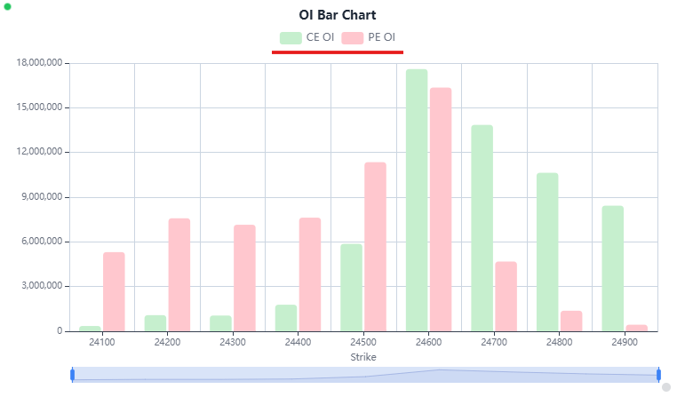
| Show legend | Toggle the series legend on or off. |
| Position | Top, Bottom, Left, or Right of the plot area. |
Style — field reference
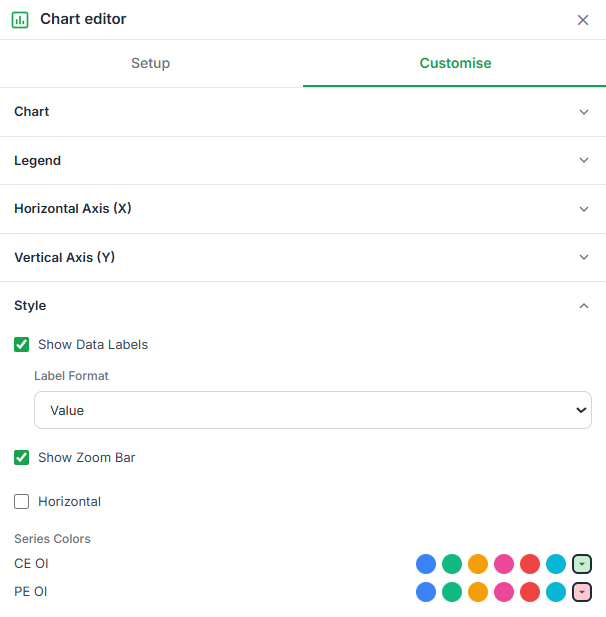
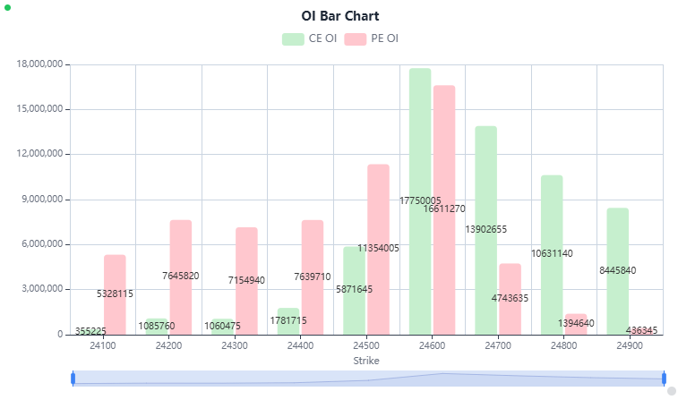
| Data labels | Shows the value at each data point directly on the chart. |
| Zoom bar | Adds a draggable range slider beneath the chart for zooming into a section of the X-axis. |
| Series colors | Individual color picker per series (Bar/Line/Area) or per slice (Pie/Donut). |
| Donut Chart (Pie only) | Converts a Pie chart into a Donut by cutting a hole in the center. |
| Inner Radius (Pie only) | Slider controlling how large the center hole is, shown as a percentage (e.g. 60%). |
| Show Labels (Pie only) | Shows each slice's category label around the chart. |
| Label Position (Pie only) | Outside or on the slice itself. |
| Show Percentages (Pie only) | Displays each slice's share of the total as a percentage alongside its label. |
| Slice Colors (Pie only) | One color picker per category value (e.g. per strike price), listed with a dropdown for a custom palette. |
Horizontal Axis (X) — field reference
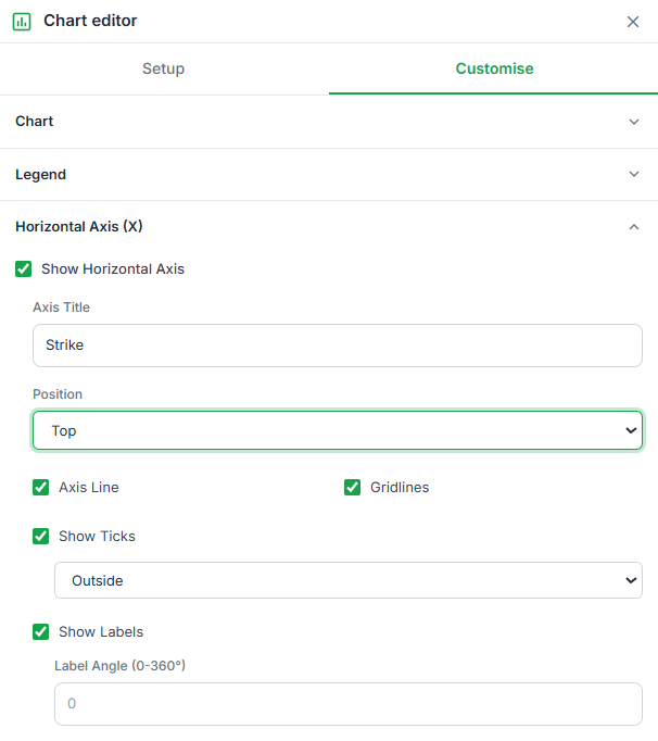
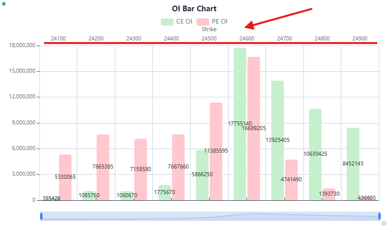
| Show / hide axis | Toggle the horizontal axis on or off. |
| Axis title | Text input for the X-axis label. |
| Position | Top or Bottom. |
| Axis line | Checkbox to show/hide the axis line. |
| Grid line | Checkbox to show/hide vertical grid lines. |
| Ticks | Show/hide tick marks, placed Outside or Inside. |
| Labels | Show/hide axis labels, plus a label angle input to rotate them. |
Vertical Axis (Y) — field reference
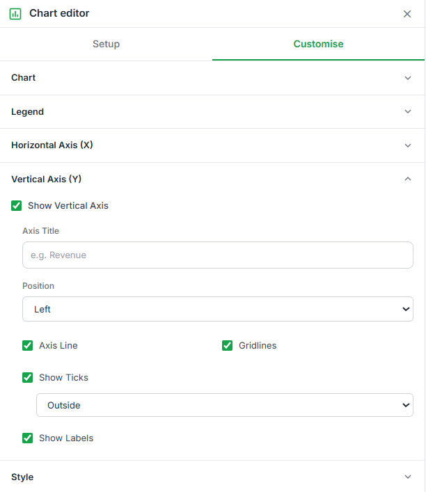
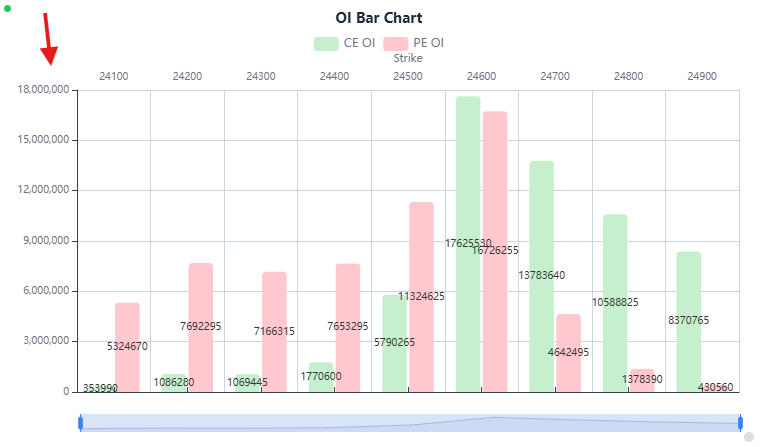
| Show vertical axis | Checkbox to show/hide the whole Y-axis. |
| Axis title | Text input for the Y-axis label, e.g. "Revenue". |
| Position | Left or Right. |
| Axis line | Checkbox to show/hide the axis line. |
| Gridlines | Checkbox to show/hide horizontal grid lines. |
| Show Ticks | Show/hide tick marks, placed Outside or Inside. |
| Show Labels | Checkbox to show/hide Y-axis labels. |
Chart Actions & Management
Once a chart exists, select it to reveal quick actions in the toolbar, or use the ? menu on the chart itself for the same options plus one extra.
Edit chart
Opens the Chart editor (Setup / Customize tabs).
Duplicate chart
Creates an identical copy of the chart on the same sheet, with the same data range and settings.
Download chart
Exports the current chart view as an image file.
Delete chart
Removes the chart from the sheet. This does not affect the underlying data.
Move to own sheet
Available from the ? menu. Moves the chart to a new dedicated sheet tab of its own.
Pie & Donut Charts: Choosing a Values Range
Pie and Donut charts can only plot one series at a time. If your data range includes multiple numeric columns (e.g. both CE Net OI and PE Net OI), the Setup tab lists each as a selectable Values Range — pick the radio button for the one you want sliced.
Sheets by Truedata
Empowering traders and analysts with high-performance real-time market data directly within their spreadsheets.
Resources
Support
© 2026 TrueData Market Data Services LLP. All rights reserved.